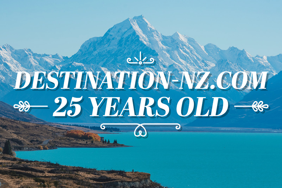
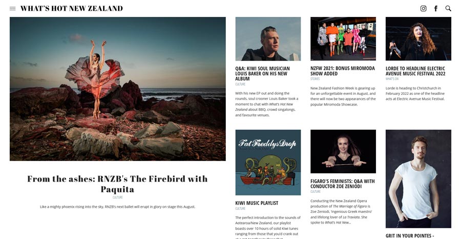
Our website has been around since the stone age of the internet – 1996! This month is our 25th birthday and we’re looking back on quarter of a century of helping people find the best of Aotearoa.
In July 1996, destination-nz.com (now What’s Hot New Zealand) was launched. It was the realisation of our big dream for an online hub people could use to find the very best of our great country.
Aimed at international visitors, the website gave handy information on getting around, finding accommodation, and – most importantly – finding the best activities to make the most of a New Zealand tour. It was an online supplement to the travel guides we already published, and frankly, people thought we were mad.
In 1996, the world wide web was still a novel thing. Barely anyone had personal computers in their homes, and smartphones weren’t yet even a twinkle in Steve Jobs’ eye. “Why,” people asked us, “would you need a website?”
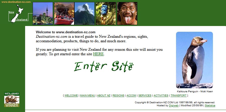
The original homepage contained instructions for how to navigate a website and use a search bar. It also had links for people to get their hands on our ‘New Zealand the Ultimate Destination’ CD-ROM for those who couldn’t quite handle the online-ness of it all. It also asked visitors to sign our online Guestbook – our early take on social media! You’d be amazed how many people filled it out and posted on the page.
We like to think we saw the future, that we rode the very front of the wave of online travel resources. And we’ve stayed on that wave.
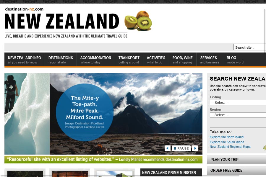
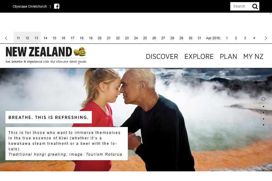
Over the years, we’ve seen the internet change around us, and we’ve changed with it. From those early experimental days where websites tended to look like text files, we’ve been through various design revolutions including colourisation, minimalism, flat design, and more – but we’ve noticed some things haven’t changed:
Ease of use Navigating a website has always been one of the most important things to address. Our early website had a simple navigation menu people could use to find all of our content. Now we have hundreds of pages of information, and our navigation has changed to point people to the most important bits, with an excellent search function you can use to find anything and everything that’s hot in New Zealand.
Content is king This has always been front of mind for us. Why should anyone visit our website? For information and entertainment! The key to a good website is quality content that is informative and up to date.
Images impress One of the best things about New Zealand is its stunning surrounds, and we’ve always strived to show it off. In the early days, glacial download speeds meant we were pretty limited and had to choose just a few of the best photos (and keep them pretty low-resolution). Luckily we now have the freedom to show off Aotearoa in all its glory!
Moving forward One thing that never changes is the need for change. What defines ‘good web design’ is a moving target. We believe our website has always demonstrated good design, but you certainly wouldn’t think so if you looked at our 1996 website today! It’s important for websites to move with the times and always offer users the best experience you can. Regular, small updates and occasional massive overhauls have always been our way of life.
In 2021, What’s Hot New Zealand is more than just an online guide for international visitors. It’s a hub where Kiwis get inspiration for exploring their own cities and regions, or planning trips around the country. It’s an information portal for visitors to get the inside word on what’s hot at their destination. It’s a news outlet for the latest in fashion, food, destination shopping, wellbeing and what’s going on at Aotearoa’s biggest and best attractions.
